Facilities management is one of BGIS’ core offerings. Due to growing demand, our previous IT leads were
tasked to revamp BGIS Assist, our in-house application providing our clients and vendors with the ability
to create and track tasks to manage their properties. Despite launching several months late and going over
budget, the application was not only received poorly but was even rejected by some clients, especially as
numerous contractual, usability, and accessibility requirements were not met.
I handled a majority of the intial UX groundwork, so most of the screens I designed are included towards
the end (lower down in this page)
Armed with less than half of the time they had, much less than a quarter of their budget, and a
string of dissatisfied clients, this is where I came in to properly see the project through.
For our clients' data privacy and due to non-disclosure agreements, a majority of the information and research has been omitted from this use case. Please excuse the debranding and blurred out sections.
Our clients were disappointed with the previous team’s app submission. With several complaints simultaneously
sent our way, I immediately went out to ask what these problems were and break down what it would take for us to meet their needs:
1. Failed Accessibility Tests based on AODA WCAG 2.0 Standards
2. The app was not usable; there are 3 viewpoints to this (the clients, their users, and our business team),
all who agree to this failure, but each of them have different reasons for why they deem it unusable
3. It was missing a separate admin controller
Since the need for it was still very clear, the company decided to embark on getting this done right. Except this time,
there was really no more for error.
I was the Lead UX/UI Designer for this project, and partially the PM due to my request to align as best as possible with our clientele. I led 2 other designers and worked closely with our technical PM and dev lead. Due to time constraints, I balanced business/user alignment, strategy, and app presentation with designing the overall flows and hi-fidelity mobile+desktop screens.
I immediately set out to clarify what the key goals were in order to ensure that our efforts were being utilized wisely.
 Beginning late February, we were only given 4 months to design and 2 additional months for deployment and adjustments), as they
were trying to meet the late summer July/August rush of work, I set out to clarify what “success” would mean for us:
1. The first was to pass accessibility standards based off of North American Standards (which also included Section 508 requirements)
2. The second was to make the application ‘stable’; thus this needed further UX vetting from the 3 parties to define what our basis
was for stability and becoming usable
3. Create an admin/management option. All of our clients were still using our current system [RealSuite] for this, but
the high demand required us to have it as its own module
I was tasked to focus on the app-side, meaning that the first two were priority and needed vetting, so I decided to test and clarify these requirements further.
With a lean approach and an emphasis on working closely with our stakeholders, I was determined to maximize what little time we had.
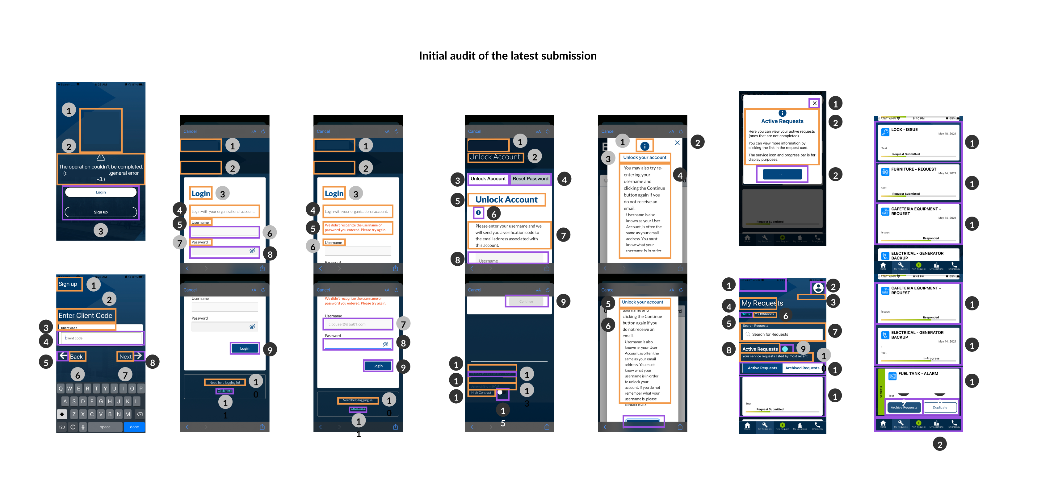
To pass accessibility standards, we first had to find out how we failed. My team and I audited everything in the current state to assess what needed design (and at times, technical) adjustments. We also worked with a third party to align with this audit
We requested for every available piece of written and recorded feedback, then asked what the user and business goals were out of using this app.
Based on these, we requested that we have a focus group from them of either the business reps, trainers (often managers in
charge of teaching the rest of their team the app/process) and actual users.
I also found the agreement to move away from providing training--however, clients ended up having to set up team-wide
sessions on top of all of the complaints and inquiries they called in for.
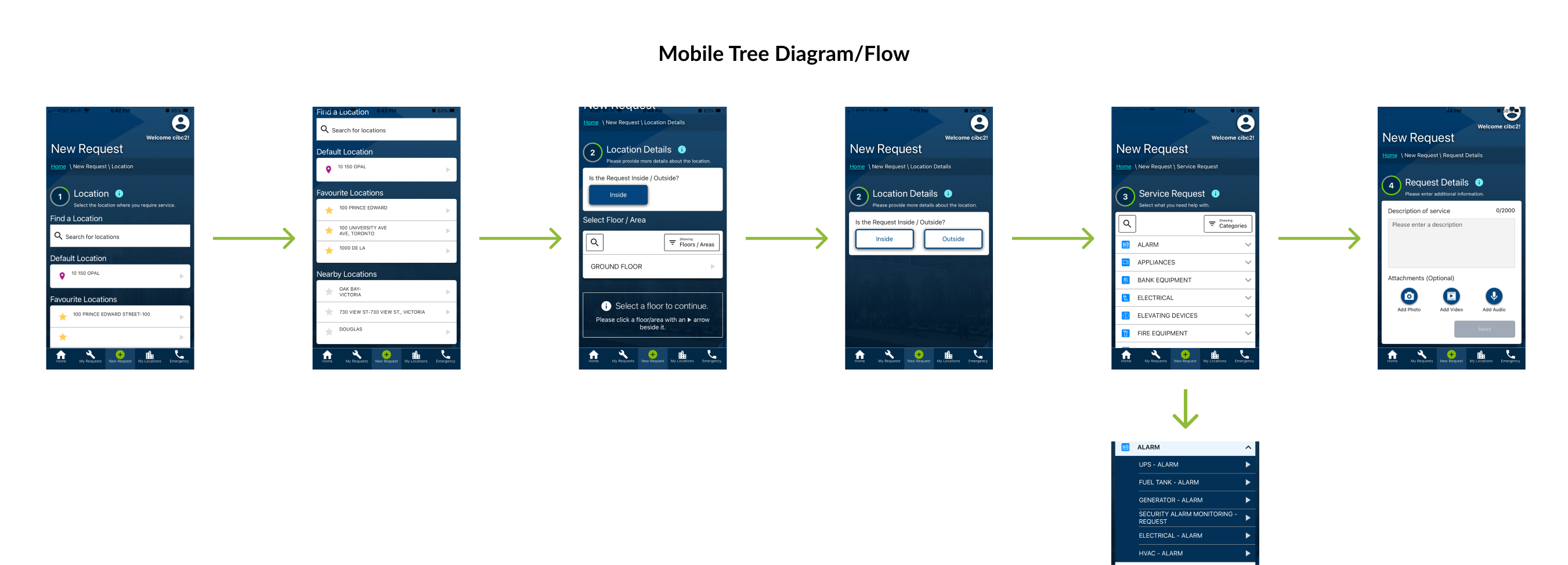
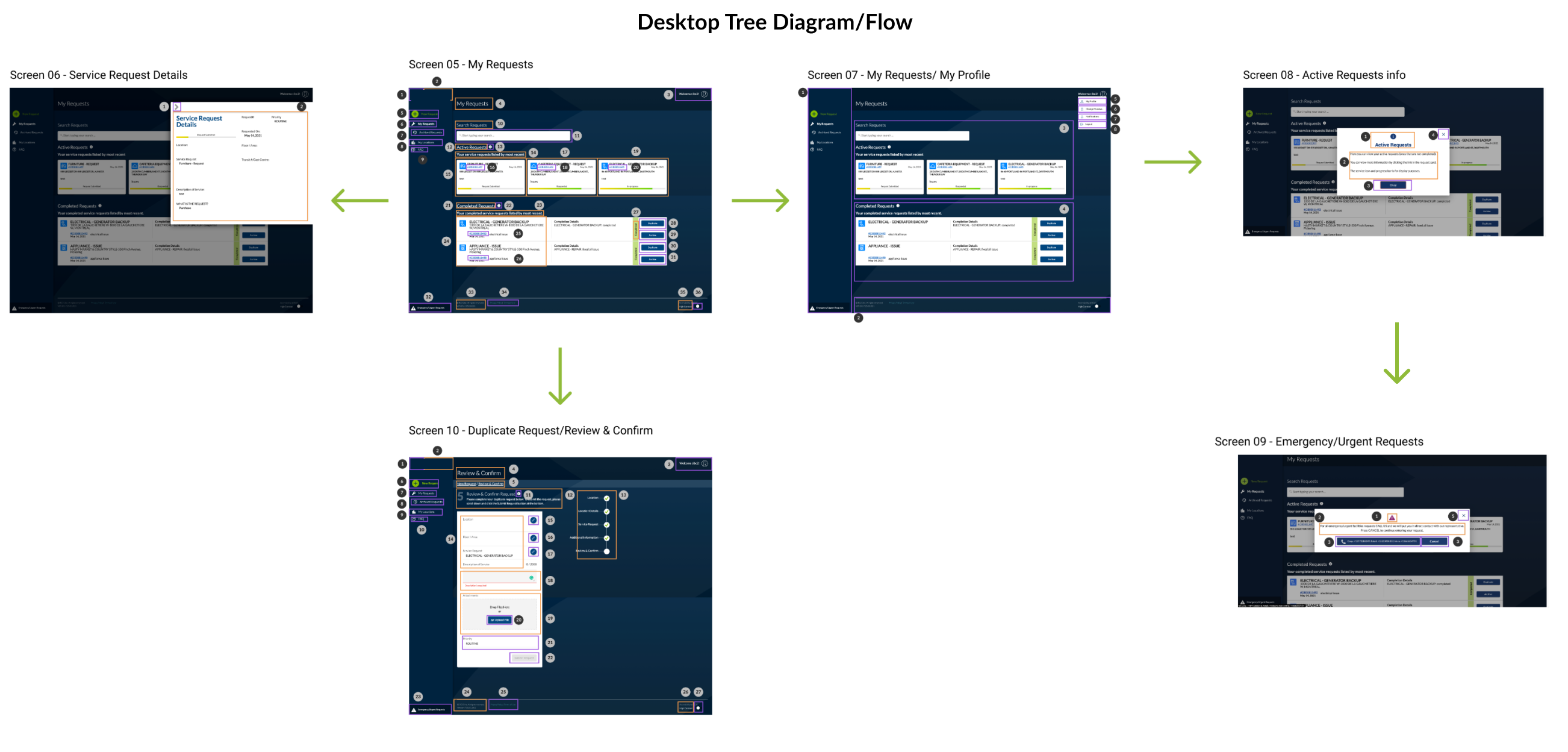
I created tree diagrams from our current flows to help the audience visualize them and see if their goals are being met. If they
were not, then they themselves can show me where the crux was for us to rethink through.
Clients were forced to subscribe to our in-house software, which was a more costly external tool for them to learn and keep track of
(it was a different experience and no separation of work type). In order to create and access the tasks being assigned.
My PM and I spoke to our dev lead to ask if we can utilize the same database while keeping them in the same BGIS system: doing so would simply
treat the application as a SaaS platform with varying levels of accounts to base their ability to use the app depending on their access.
This costs less on them and means that they only need to get to know one application--if this didn’t significantly cost us more, it also
meant that it would make it easier for us to segment and price out their workload to this one platform rather than have it intertwined with
the rest of the module it was originally thrown in with.
This had accounting, usability, and business benefits. Furthermore the development costs may have been a little bit more but it leveraged
the existing work we were placing on to the revamp, they just had to put some more effort into the security protocols to coincide with the architecture
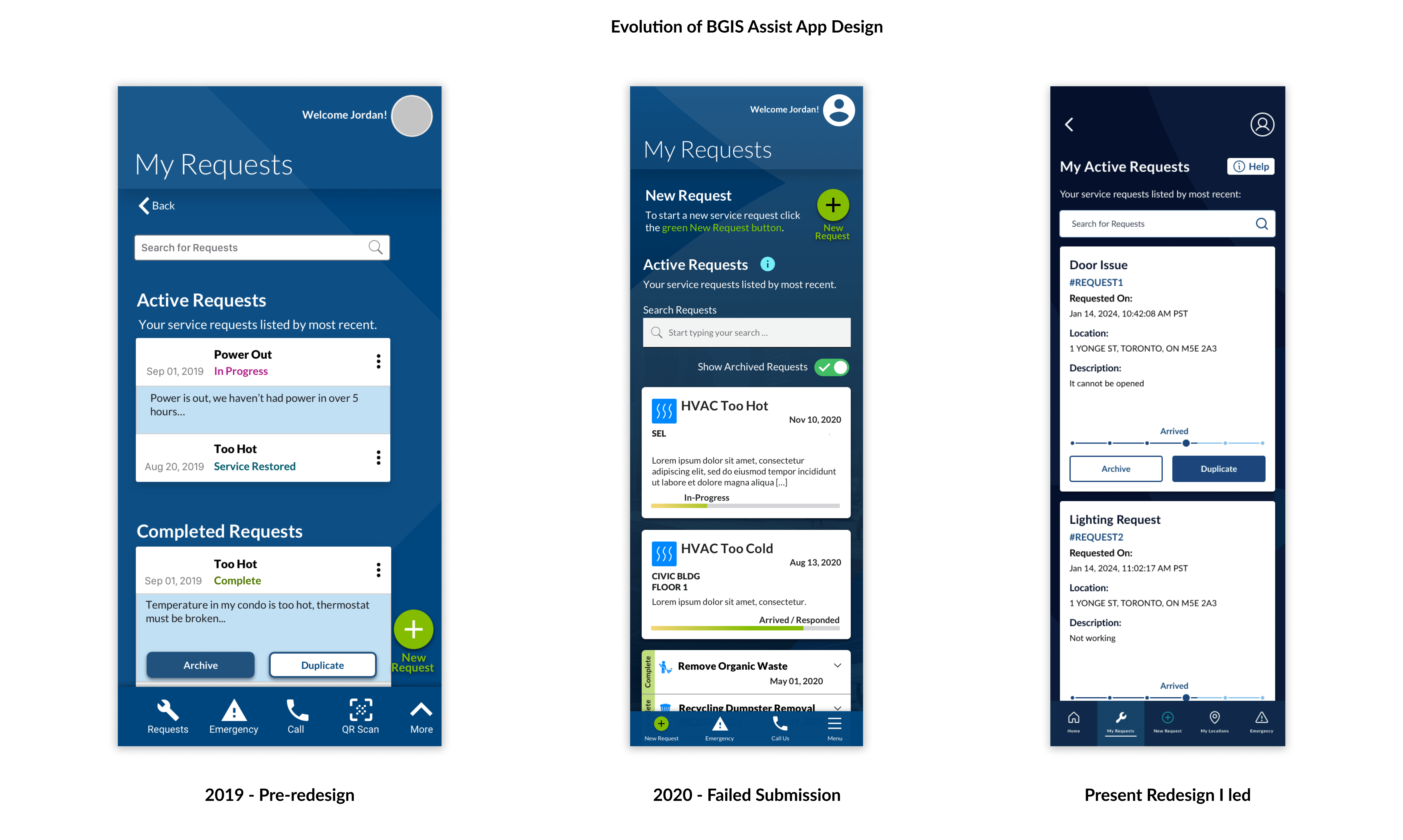
As there was a desktop base that existed, but was only worked on halfway before being abandoned, I tried to build on that instead to save some time:
Auditing helped us prove that while a lot of the UI and general usability needed revamping, we did not need to perform a complete overhaul of the app. However, I did need to be creative with testing as it was all done remotely.
1. This meant that after we dissected the pages & components we would adjust, we can begin to compare it w/ our branding guidelines and design system. The extra level of complexity is that the DS had a light base, while this build was much closer to a dark mode
2. Tree Testing led me to evaluate the usability and our screens. From here I needed to immediately define if it was even worth going
into lo-fi, primarily because of our short deadline but mostly because we already had hi-fi available that could be adjusted and revamped,
rather than spending our time on starting from scratch (if this is what made sense).
My hypothesis was right, not only because our clients did not want to start right from the beginning, but because the general flows
made some sense; they just required optimizing as well as better instructional/helper functions along the way
3. As it was confirmed that leveraging the same database was doable, I set out to maximize our current user-focused app to create a management-based version of it to propose to the clients and define what kind of accounts we need aside from the users to perform their tasks. We defined that on top of the (1) user-side, we needed a (2) task assigner and a (3) management level user that can adjust these permissions (3 user account types in total). Hierarchically speaking, this simplified it to a top down approach that aligned with their management structures, how we would set up permission controls, and isolated pricing.
We started out by making adjustments to the components, text, spacing, and base standards that we outlined would need updating regardless.
We also compared with our Design System and branding guidelines.
While this was happening, I segmented the work to one designer looking into checking that these styling changes pass the accessibility
requirements we set (AA to AAA when possible) while another focused on the icons and upgrade of a few of the base components. This allowed me
to engage with the business as they confirmed my plans on how this would coincide within the same environment as the management portion.
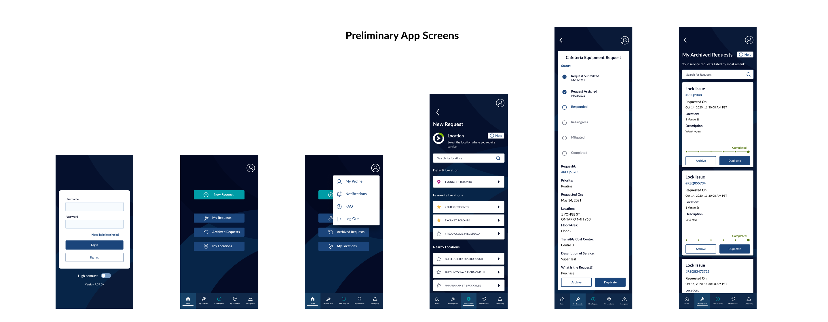
From here on out, I segmented each section of the user-side build. I designed a majority of the mobile UI:
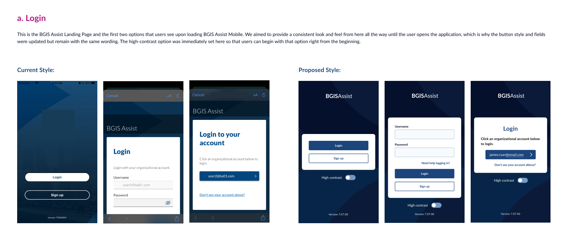
a. Login - which I spent a lot of time simplifying with the PM and dev lead as there plenty of immediate complaints here
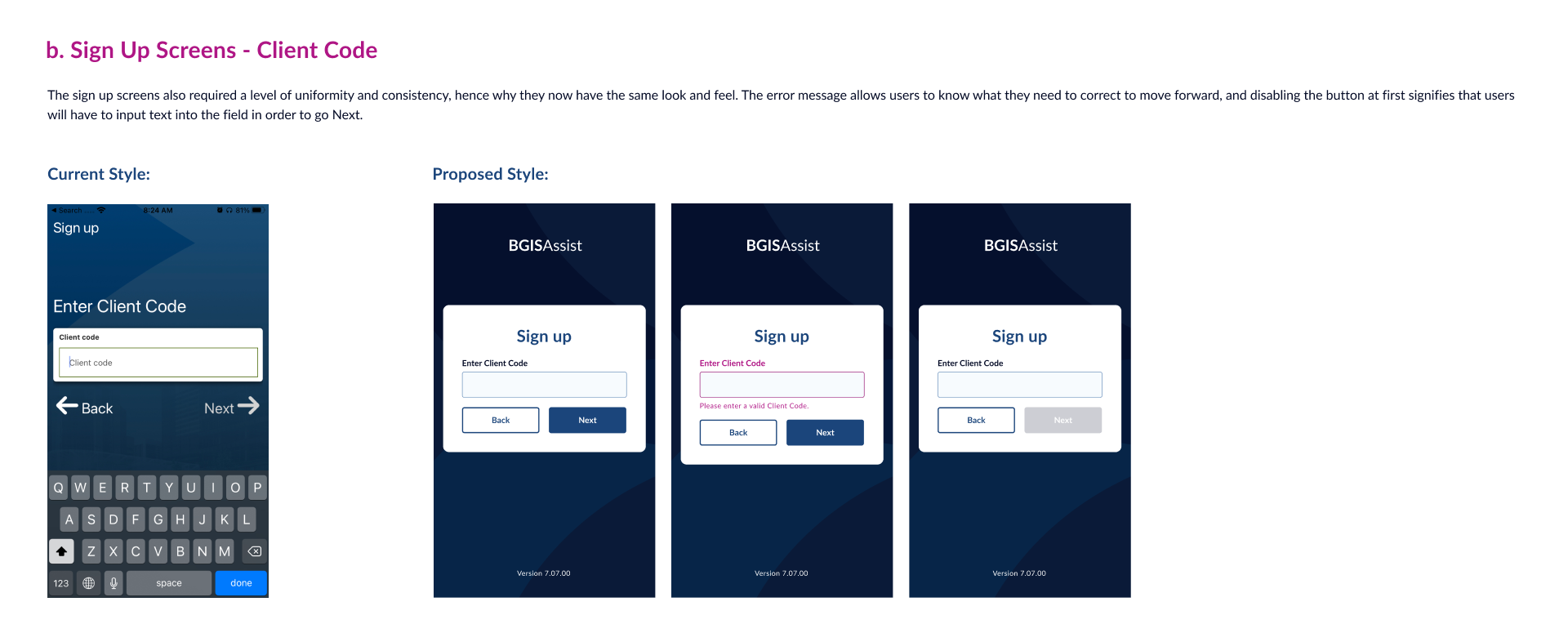
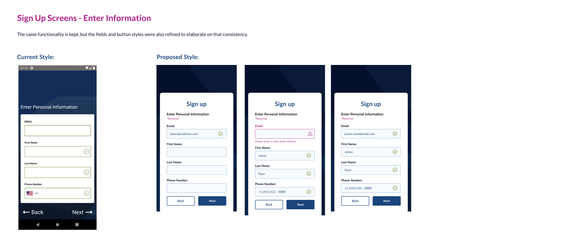
b. Signup - I made sure to break this down with the appropriate Progressive Disclosure measures
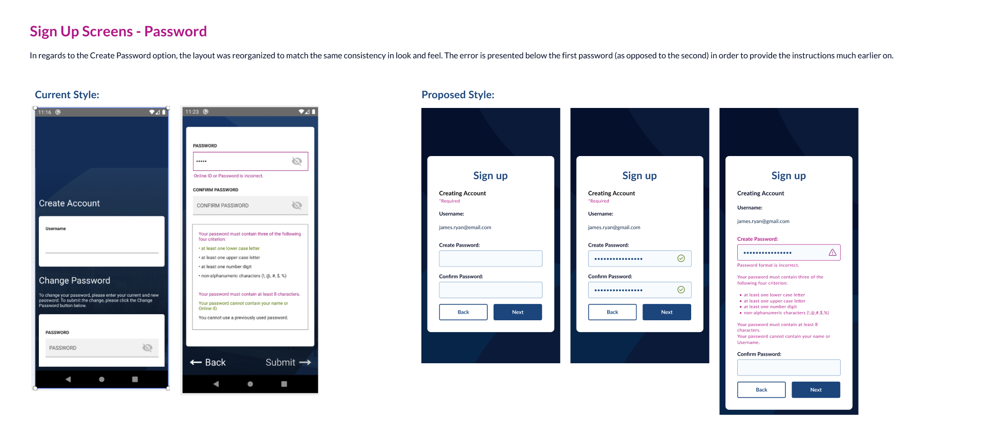
c. Setting up password--which was not mentioned earlier but we found that this was a huge point for reducing calls to our support centre
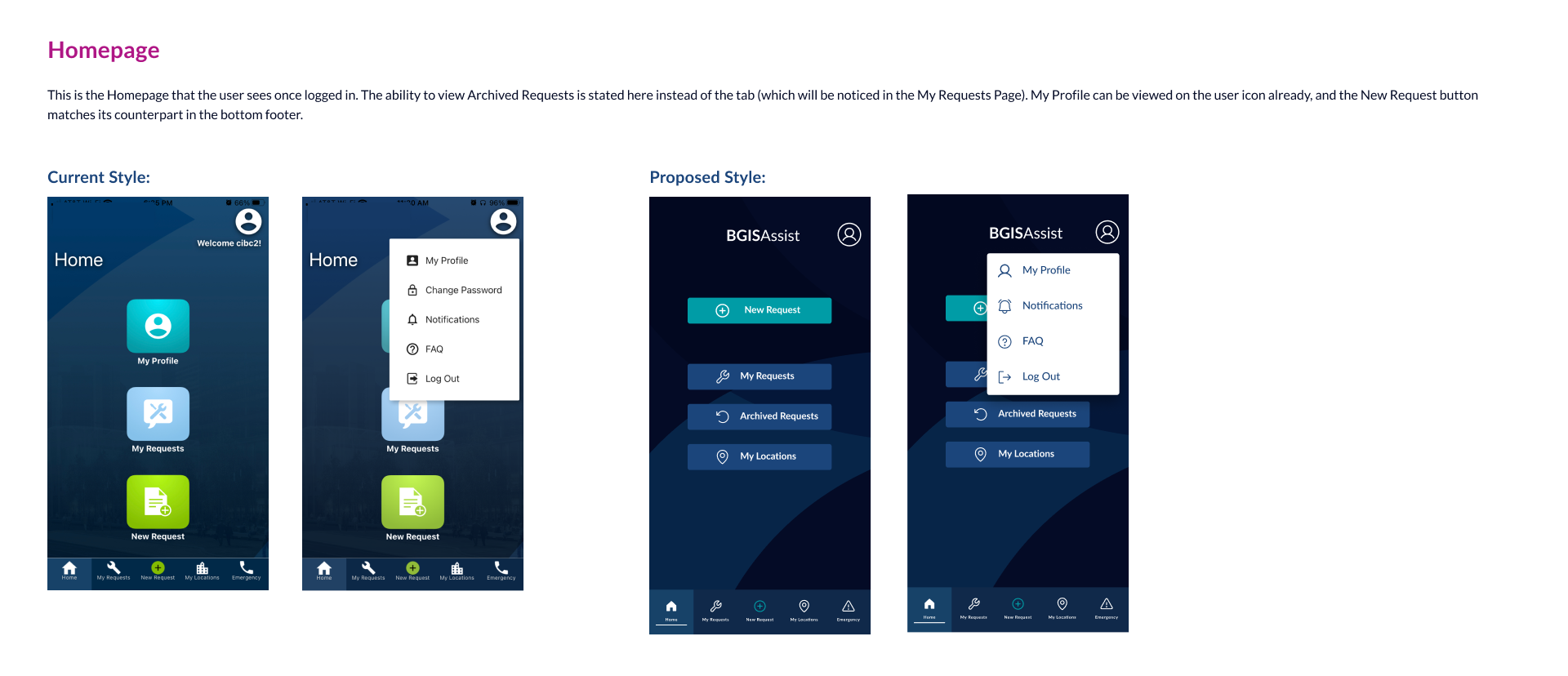
d. Homepage and Quick Menu
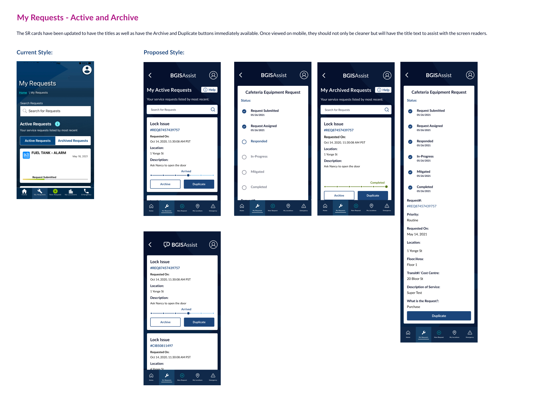
e. Performing tasks: Active and Archived
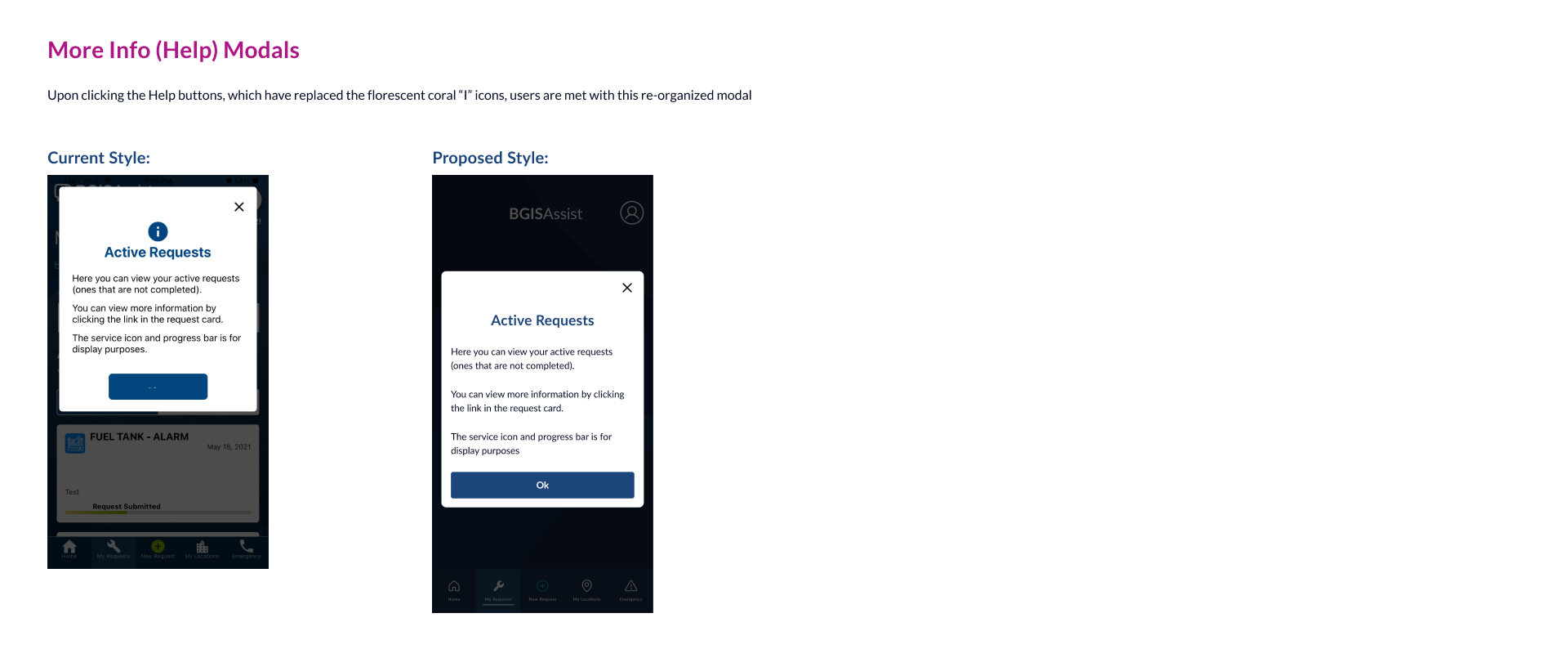
f. Help (this was requested by several sources just incase)
As for any other (client-specific) sections and iconography, those were handled by my other team members. This made it easy for our designers to follow an agile approach as they take responsibility for a section, bring it to me for review, then tackle another as I present and get feedback for us to iterate with.
When the app portion was submitted for development and deployment, my team spent the rest of our time, with the same process,
for the desktop website/browser portion which is also where the management side resided. Because we were keen on evaluating our approach
early on, our gamble paid off and we had a much clearer path to succeed with this project as both systems aligned with their (3) goals.
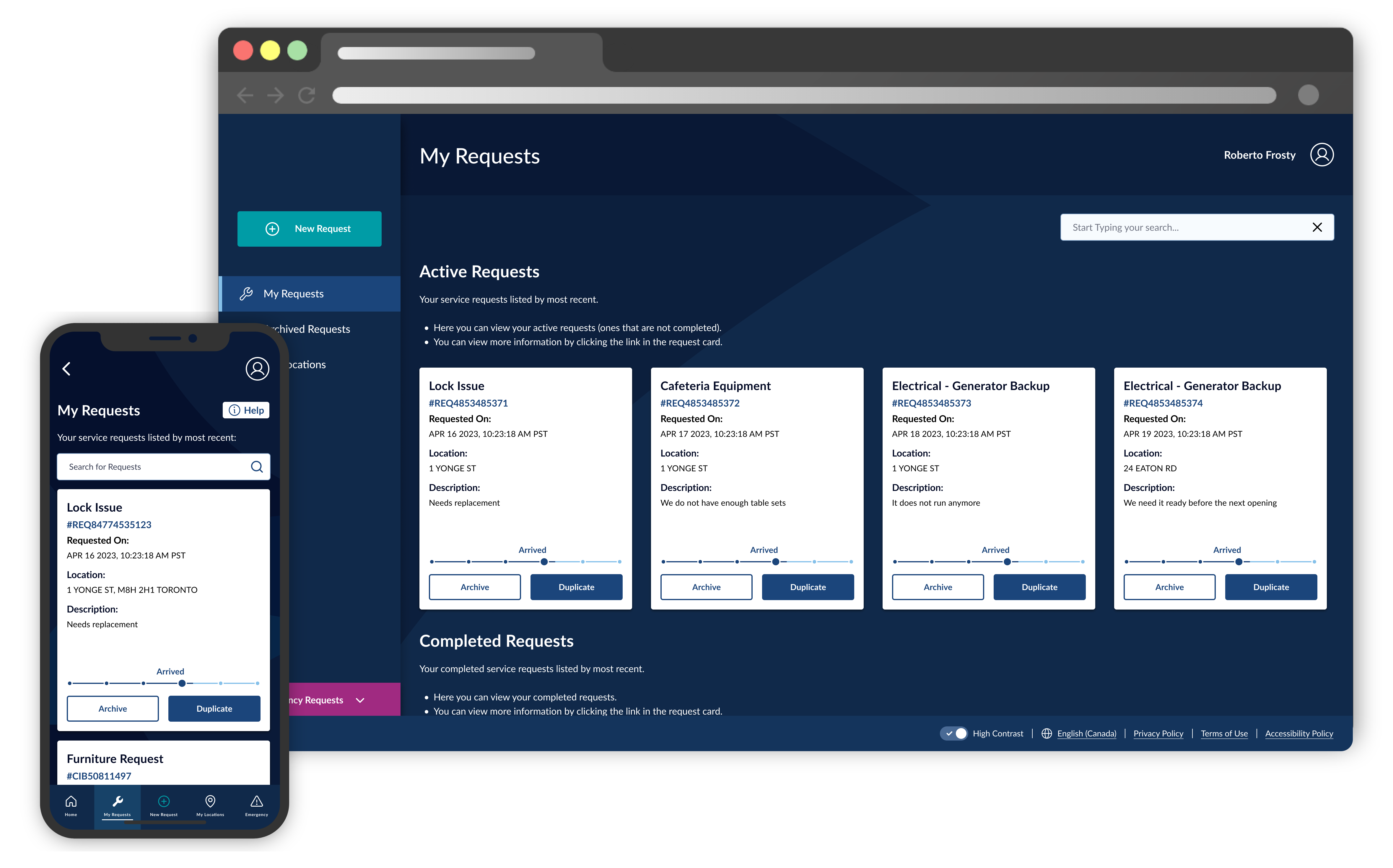
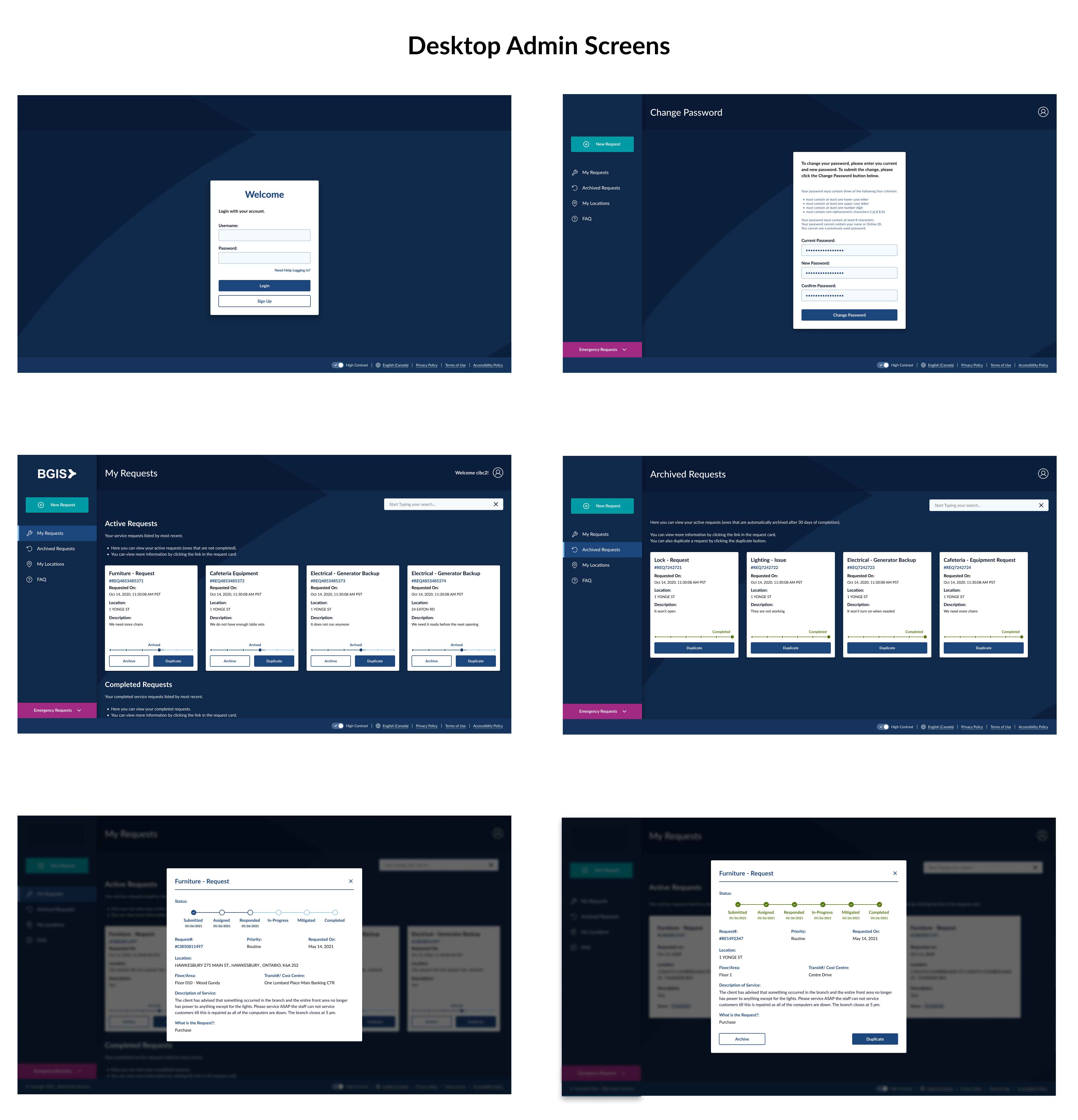
These are the desktop screens I designed:
Deployment wasn’t necessarily smooth but because we had regular sessions with the business reps, we were transparent enough that everyone knew what was going on and the timeline at hand
More accessibility checks were performed, and thankfully due to our competent teamwork, they actually worked to our favour.
Here are some of the major results we accomplished within the first 60 days of gradual release:
a. Our major accessibility evaluations were performed by Deque (one of the top Accessibility companies who are active on the web
committee writing accessibility standards and are in charge of aXe, one of the most popular web accessibility testing apps). On our
final check, they not only confirmed our AA compliance but even commented on how we exceptionally showcased “never before seen results”
as part of their praise for our efforts.
b. Both our leadership team as well as our clients were very pleased to see this, and it earned our team their confidence in us back.
c. With this, the clients that were in the midst of rejecting us gave immediate turnarounds and had this app integrated back into their teams’ systems
d. Upon release, there were calls about bugs here and there, but we had no requests, beyond one round, calling for training
Thanks to our incredible team, we were able to meet and surpass our targets:
a. Received a nearly perfect score on the accessibility checks (unprecedented but confirmed by the auditor) → Goal
#1 was achieved
b. Clients were very pleased with the revamped design but didn’t feel alienated as if it was too large of an overhaul
c. Customers saved an estimated 80% on training costs (instead of 2+ sessions per new user). This was not only good
value to them but also great for us because we were short-staffed on trainers with all of our other new products
released and the company was moving away from the model needing to teach users. This made us to be more competitive
and be able to offer this to a much wider market → this and reduction of general complaints (for the first 60-90 days) meant a success in Goal #2
d. Fixing up Sign up/Account Setup/Forgot Password or Username were found to be major points for reducing those calls
e. With no need for App Store checks, we deployed the management accounts a little later but this was fine as clients and users were busy setting
their teams up for the user-side → answered Goal #3
With the success of this launch, our leadership team relayed multiple benefits it would be embarking on thanks to
this: Short term it is a stand-alone application with an interconnected database, long-term it can be introduced as
part of our Suite of products in a more connected yet self-sufficient manner, as its capacity to be a stand-alone app
is crucial to the short term.
For my team, we were more so excited about how this project allowed us to build on our client relationships and
continue on this iterative approach. We were able to establish more open communication within outside teams of
the IT department, and found that there was work here (such as the Dark Mode) that can be further utilized.
Most importantly, I have since been able to leverage our success here to implement better usability and
accessibility standards throughout RealSuite, BGIS’ flagship product that I am currently leading design on.
You can view my work for this in the next case study, Redesign RealSuite.