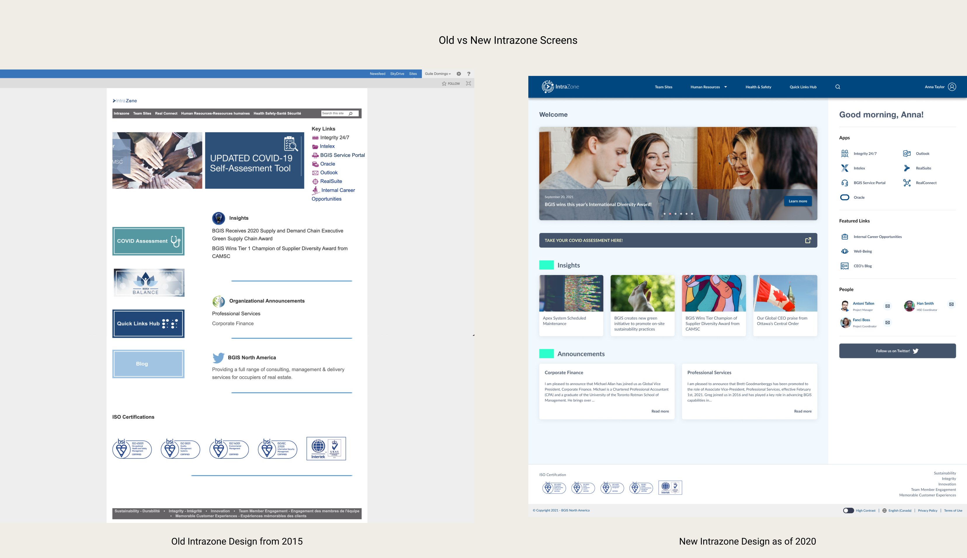
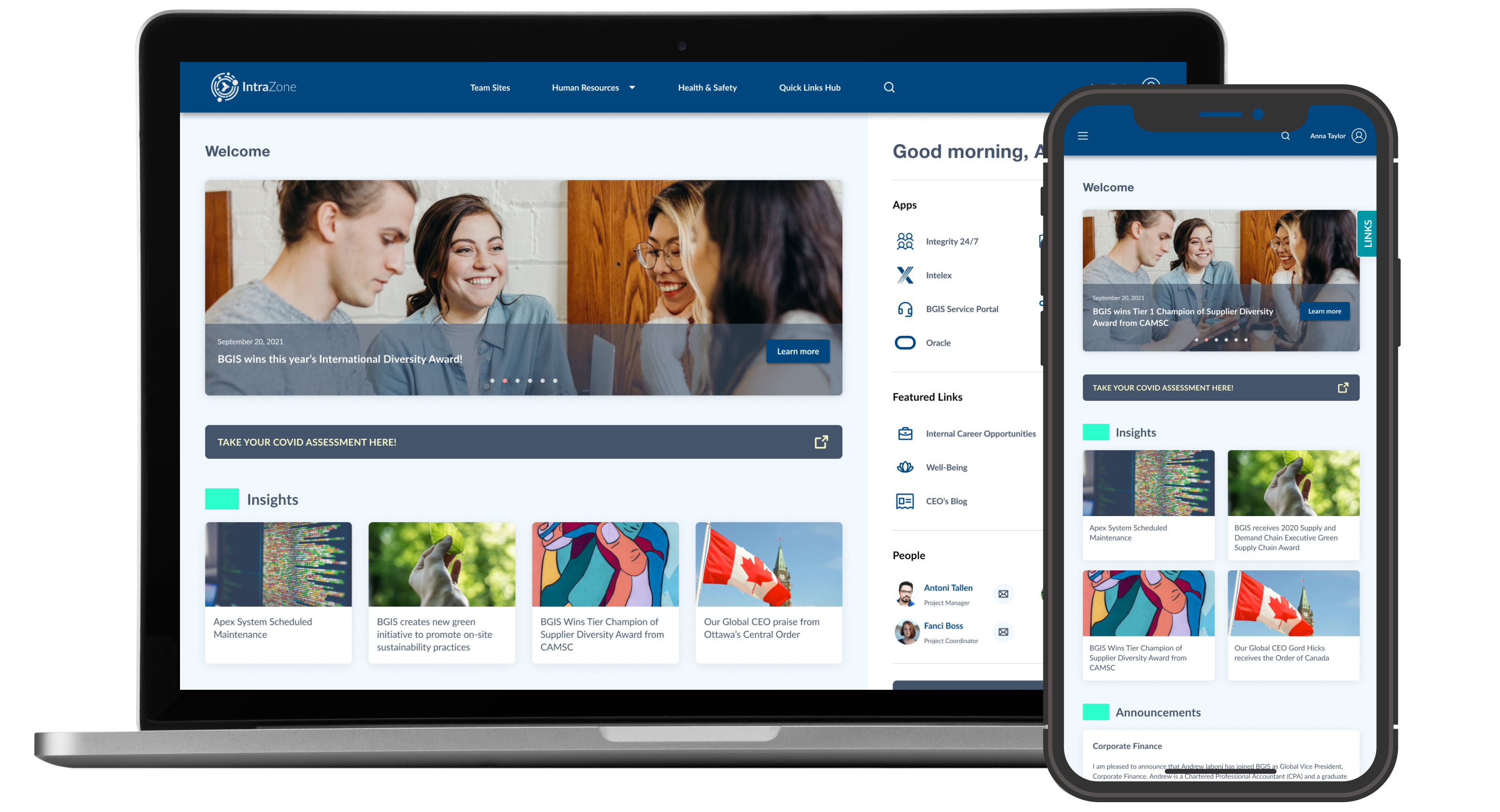
In the beginning of 2020, I was tasked with redesigning IntraZone, the BGIS in-house intranet used by all
20,000+ employees and affiliates of BGIS. It is a web portal designed to host links to services, resources,
news, and notices by the company for all of its employees. While the concept made sense to the leadership
team in charge of pushing this out in 2015, there seems to be a disconnect between them and its actual users,
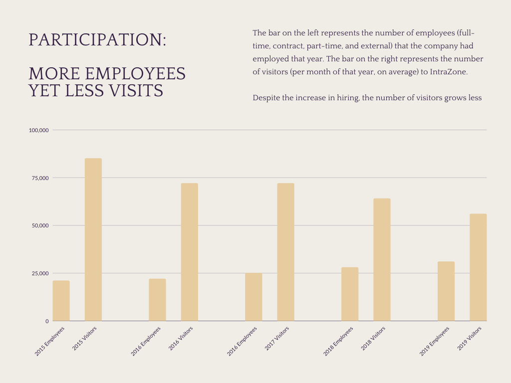
as BGIS as an organization has been growing in both full-time and contract positions, and yet the overall
engagement with this platform has only gone down over the years. With this redesign, I not only aimed to make
IntraZone easier to use, but also more useful to the rest of the BGIS community.
As the project took place prior to the 2020 pandemic lockdown in Toronto, Canada, I was able to conduct
in-person research and discussion sessions.
Due to non-disclosure agreements, only a reduced/summarized portion of the information and research are presented in this use case. Please excuse the debranding and blurred out sections.
Participation (measured in number of visits) and overall satisfaction rate for this platform has been low, which aligns with the numerous complaints received from all levels, from ground-level contractors to middle management who were instructed to encourage their teams to use IntraZone.
The leaders thought that this would all be solved by maintaining the content (as they believed that is what kept people’s attention) and implementing a visual revamp, then simply “cleaning up the UX” along the way. Once assigned, I was able to get support to delve deeper and properly identify the problem/uncover the actual misalignment.
I was assigned as the lead product designer, both redesigning the UI and coordinating with the PM, front-end devs and a visual designer. After planning for our only major constraint of 4 months (in order to roll this out by the second half of 2020), I requested to conduct stakeholder and user interviews amongst BGIS staff in order to clearly define what the goals are and what the logical steps would be to attain them. By clarifying these points, I could go back to the leadership team, debunk some of the assumptions, and better align to define their metrics for success.
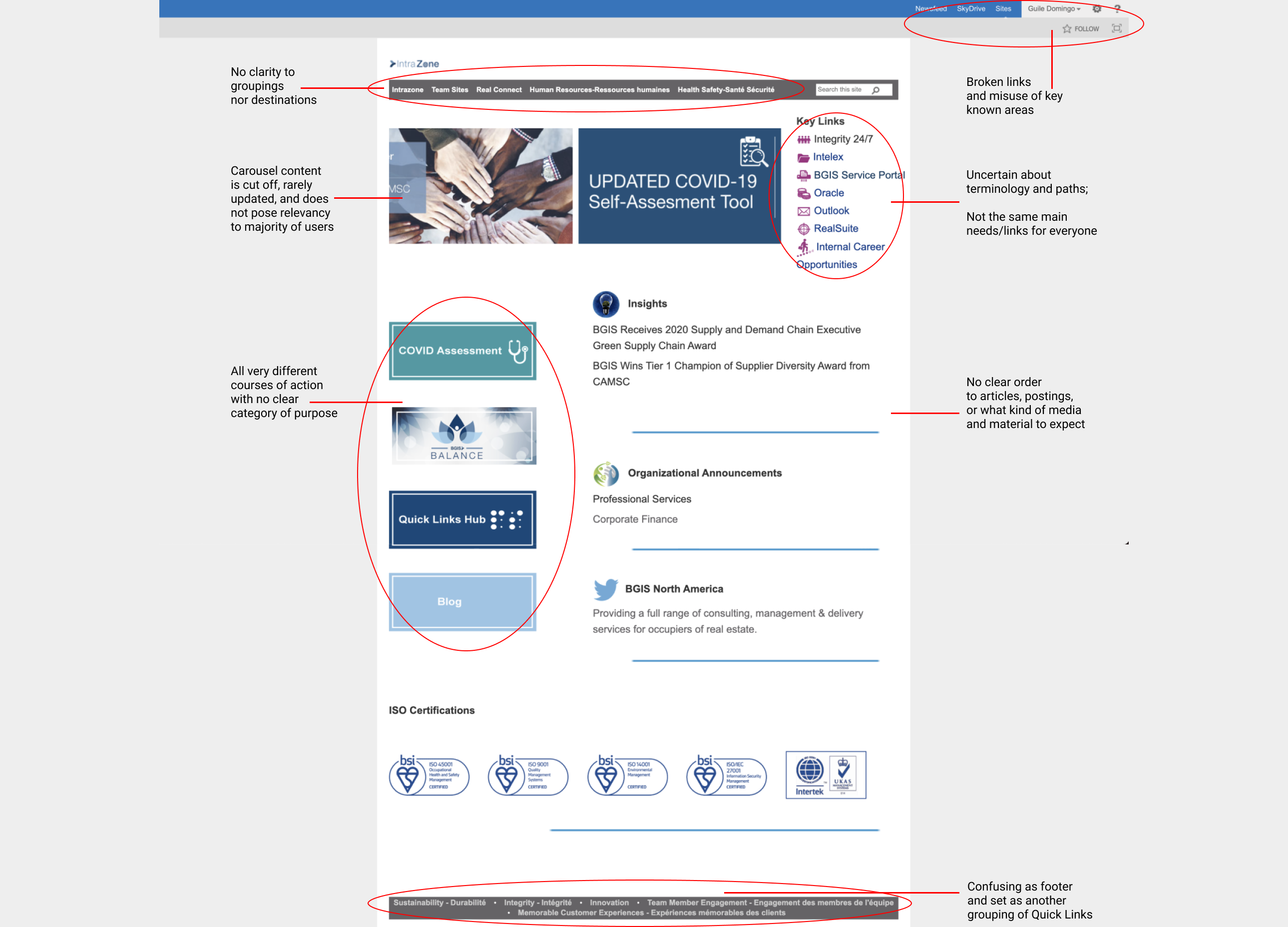
Myself (someone familiar with the site), two other contract usability experts, and our PM, devised a set
of guidelines as a basis for evaluating IntraZone. Here is the list and our summary of results:
1. Match between system and the real world:
Several terminologies were either BGIS-specific, case/field-specific, or both, when they should be
universally accepted terms and phrases that would require less thinking or deeper understanding.
2. Recognition rather than recall:
Due to the specific terms used, users are forced to either remember which pages to go to for whichever
links they may need, or must ask for the help of another colleague to direct them to the necessary actions/objects.
3. User control and freedom + Error recovery and recognition:
There are many missing Back/Exit buttons, as well as a lack of “forgiveness'' in users taking the wrong route,
meaning that users would need to start their task over or even find their own ways to get to their desired location.
4. Flexibility and efficiency of use:
While there are areas such as Quick Links, Team Sites, and a selection of featured links on the homepage,
much of the terminology is confusing and their actual endpoints are misleading, not to mention a lack of proper groupings.
5. Aesthetic and minimalist design:
Somewhat tied to Consistency and Standards, there is no visible direction nor recognizability in the way the site
is structured and organized. Boundaries, spacings, order, and a clear flow are inconsistent from the entire design.
With these evaluations, I went to speak with different users to make more sense of my findings:
1. Heat Maps
I used Heat Maps to find out where our users frequented most. The leaders’ belief was that by putting the banner
right next to the links made it more likely for users to view them. While this was partly correct, users often
hovered nearby as they waited, but the content themselves were not interesting enough for them to actually check them out.
Unfortunately, I am not allowed to share the heat maps and screen-observing-related material at this time
2. Card-sorting
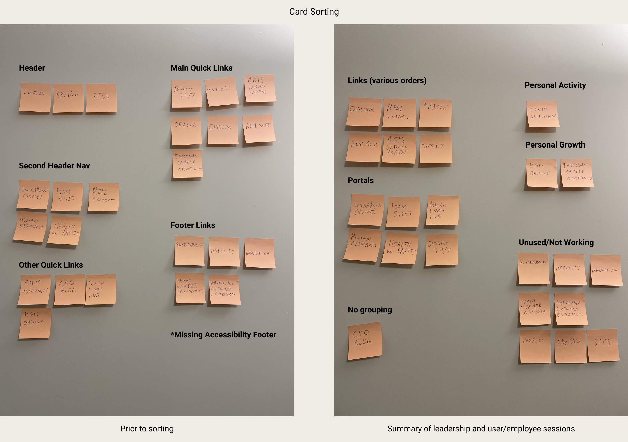
I performed card-sorting sessions in order to define appropriate groupings based on needs and what made sense to
users. Some grouped them based on activities in tandem, others grouped them by frequency of use, but all of them
agreed that a restructuring (of the Information Architecture was necessary).
3. User Interviews
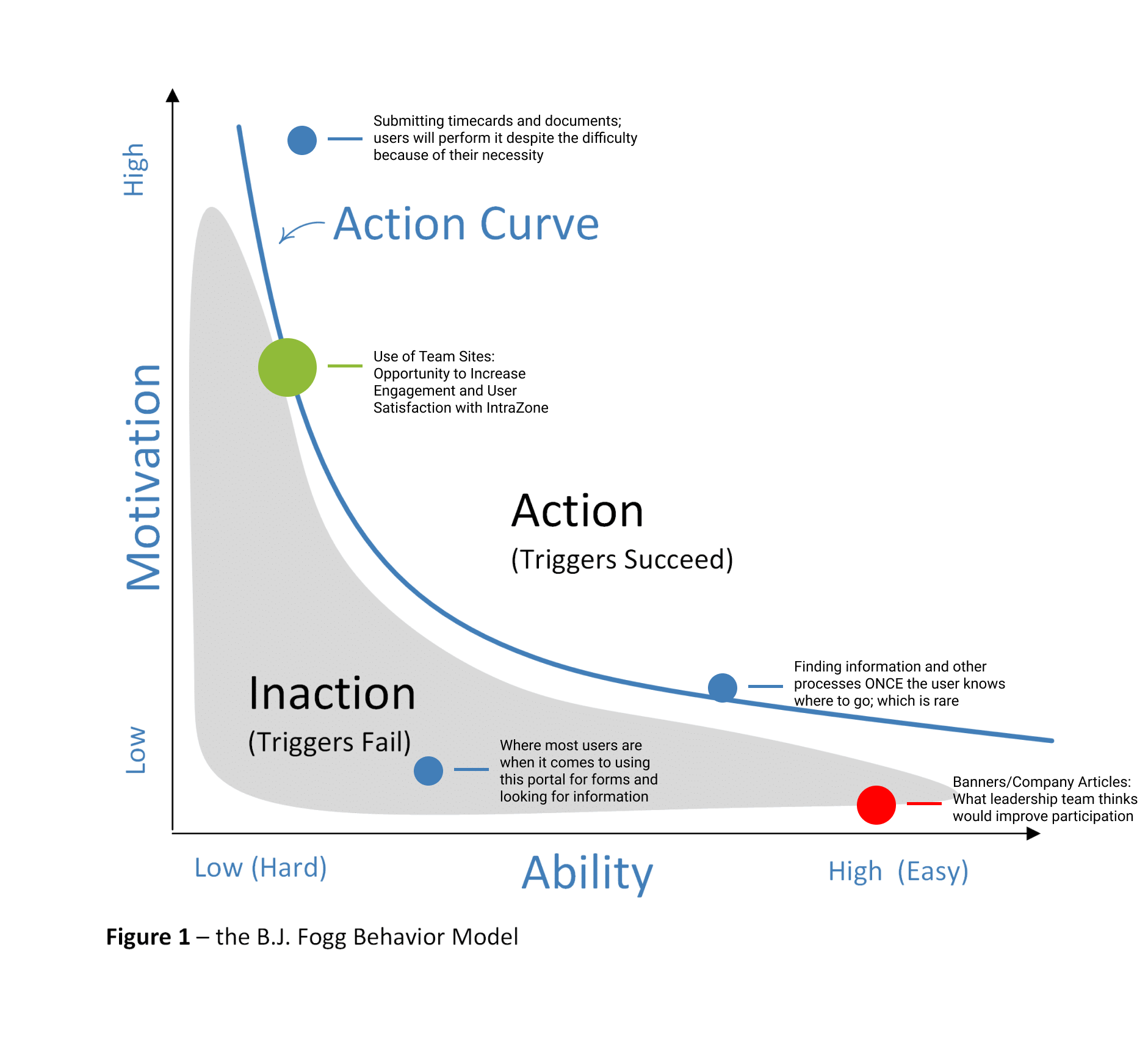
I also held User Interviews with as many as them as possible to find out their own Goals and Motivations/Abilities for their Actions.
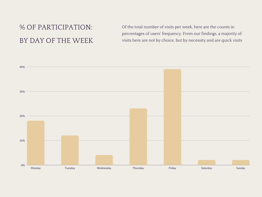
In speaking to our users, I went back to the visitation statistics we had, and went down to the weekly level as it
related best to their regular cycles. From here, in accordance with my findings, I began to uncover their habits, pain points,
and better clarify this disconnect between them and the leadership team:
1. Users most frequently visit on Thursdays and Fridays to submit timecards for payroll. However, this has been
troublesome so they have simply bookmarked the link. It does not always work (due to VPN/connection permissions),
but they said that, “it was worth attempting rather than always going through the hassle of waiting on IntraZone”.
2. The second reason for frequent visits is to manage their Community Pages (known as Team Site) on IntraZone.
However, many have a secondary group page on social media platforms as the templates/pages were difficult to use,
set up, and expand on.
3. The third is when they have a complaint or tech/equipment request. Due to these documents being
difficult to find, they would either speak to their manager about them instead or be willing enough to
wait 2-3 hours at our hotline.
4. The fourth is for scheduling vacation, need to find out process info, reference documentation,
which they are forced to be patient with as there is no other alternative.
5. And finally, users are never really there to browse. They’re never given time for it nor do they
find any reason to.
6. A big misconception debunked was that even if some users appeared to stay on the site for long,
it was not because they were browsing but due to being lost and/or waiting for the pages to load.
This was a great opportunity to redefine goals that align with user actions and understandings.
Due to the length of findings, I walked some of the leaders through them until we came to an understanding
that a redirection of priorities needed to be done. They still wanted to promote BGIS News and focus on
participation, but instead of forcing it by maximizing BGIS content, we can build on two things:
making this portal convenient to use/navigate through and allow users the autonomy to help grow
this site themselves.
As I found, Team Sites was that solution to autonomy and better long-term promotion, as many users were
found to have intrinsic motivation (whether by their desire to participate in group activities or due to peer
pressure from their teams) to try and make these sub-groups work, even if it meant setting up a separate social
media page to simply make up for the slowness of using IntraZone.
This led us to redefine the goals set by the leaders, and align them with the actions made available to our
users to promote greater usage of IntraZone (thus increasing traffic and a higher likelihood for BGIS to be
up-to-date/interested in what is happening with their company).
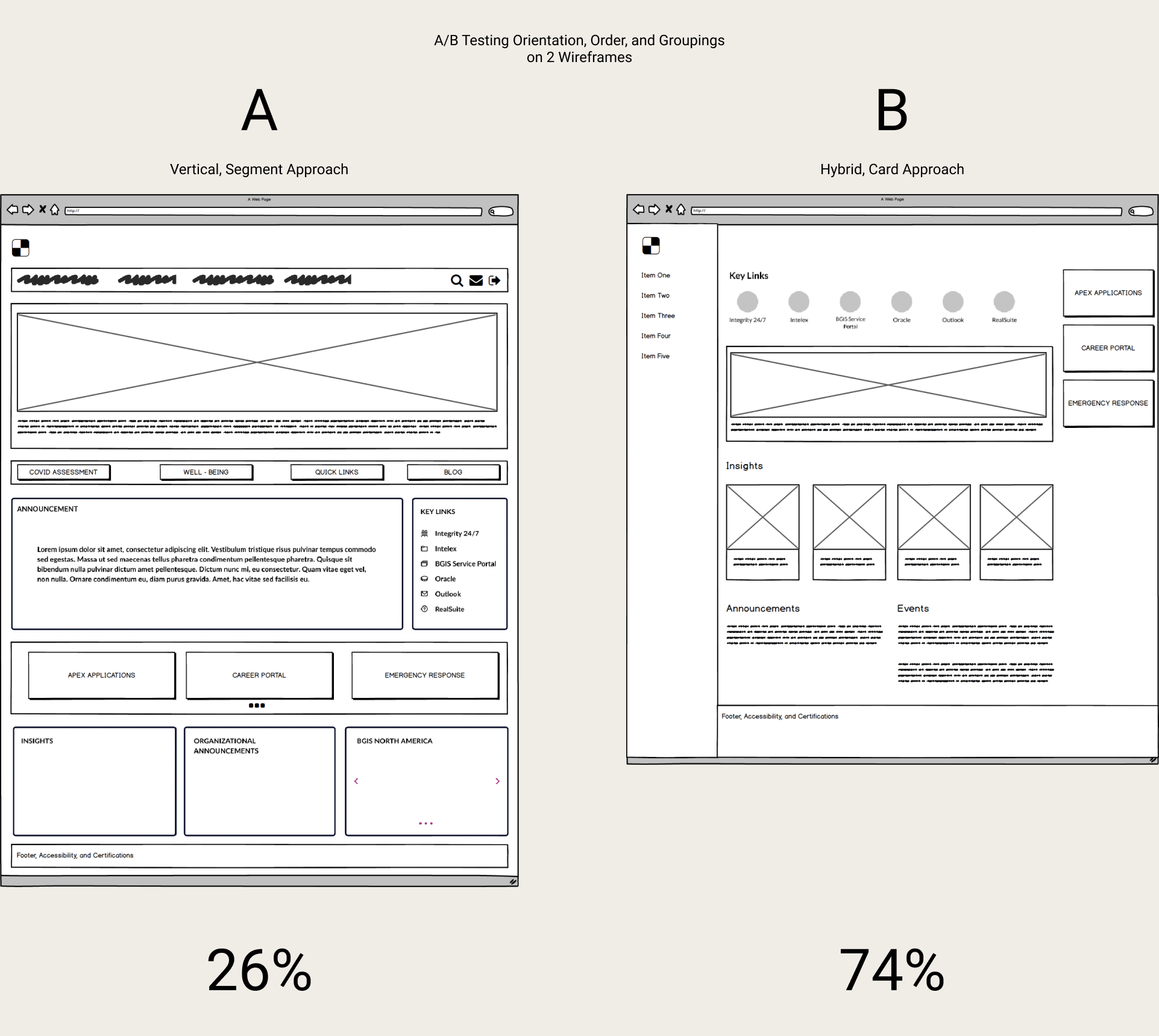
With the new goals and the restructuring of the IA thanks to prior card-sorting, I created two wireframes and prototyped them to A/B test amongst our users. I already had the Heuristics guidelines set as my basis for better usability.
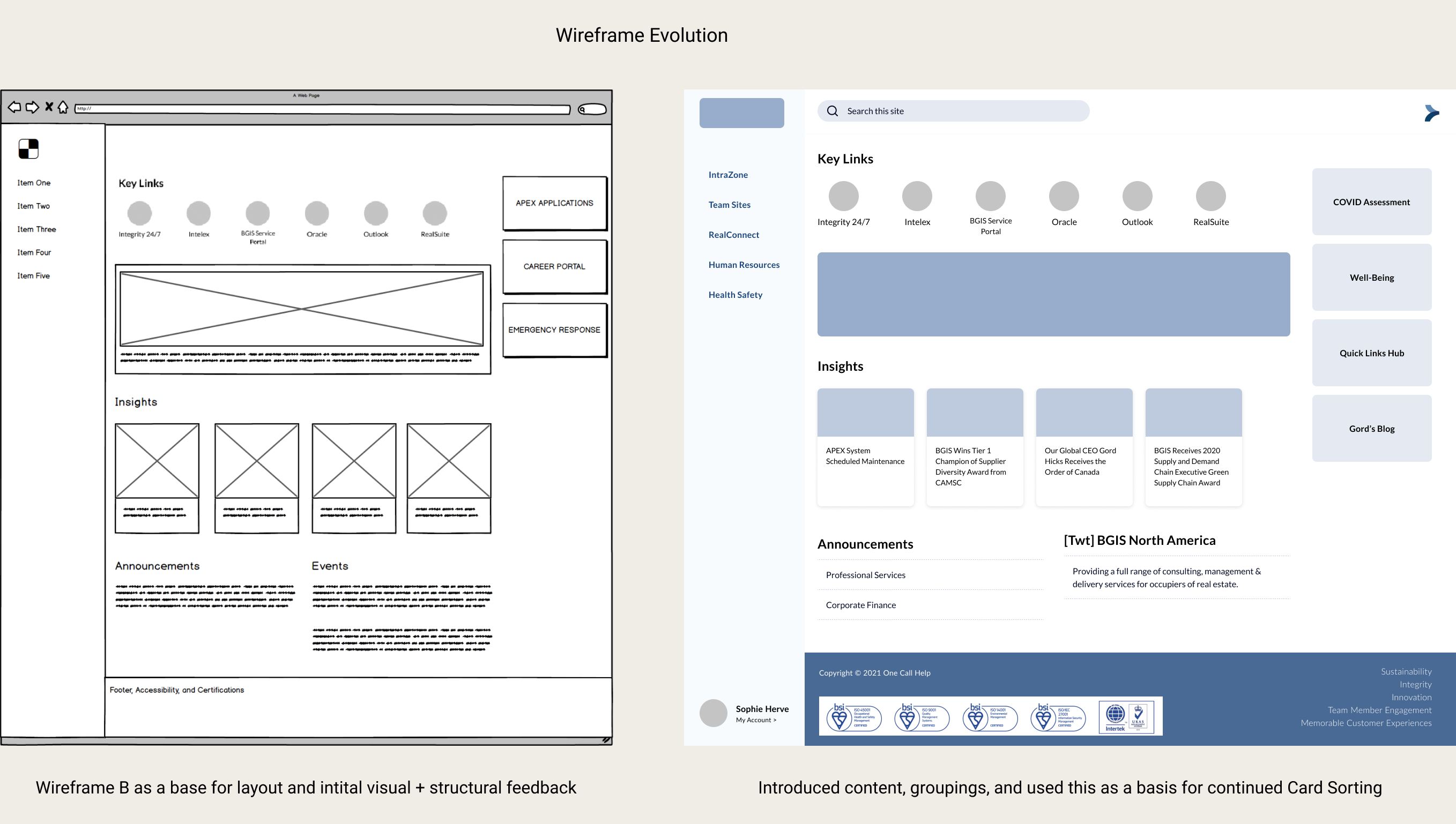
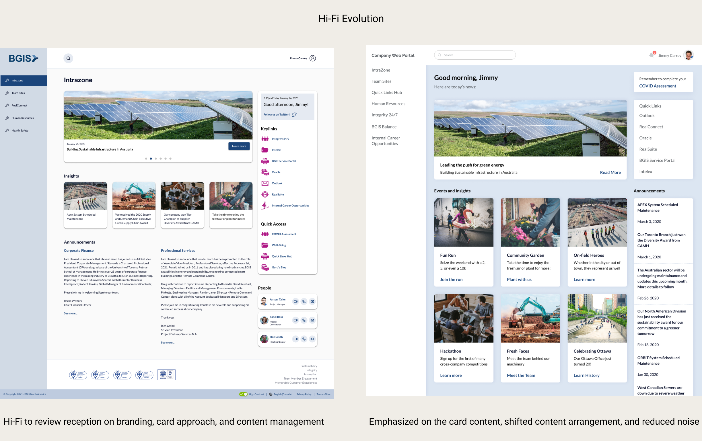
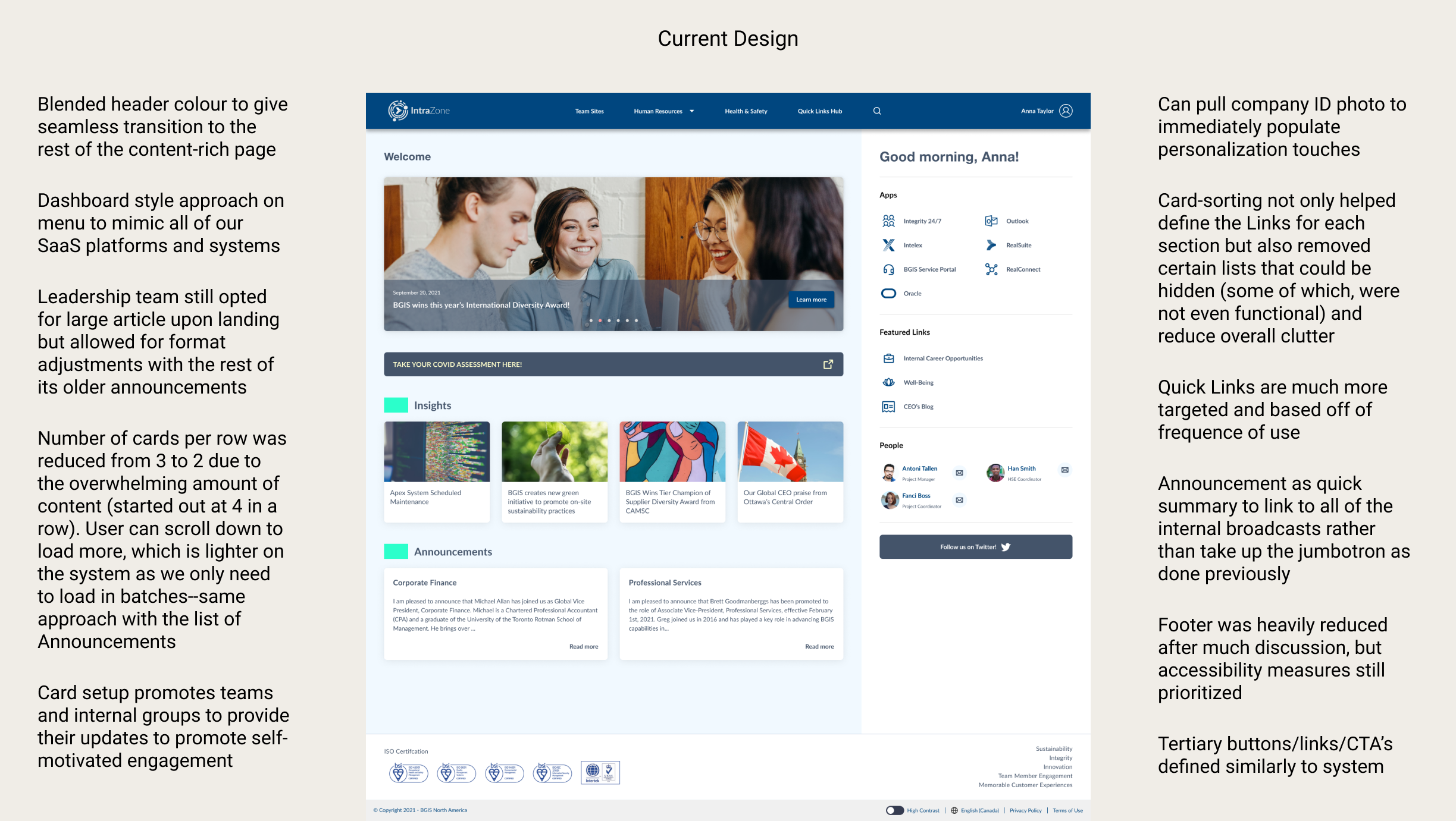
As they were more drawn to Sample B, I used that as a foundation for the hi-fidelity mockup for IntraZone. This selection combined several sections, did away with a few pages, and restructured IntraZone so that the important and most frequented items are at the forefront of the user’s homepage with better navigation/grouping organization. Conceptually, it remains the same despite a physical and organizational overhaul, so that the user has one less thing to learn about.
Usability was mostly covered in the previous stages, so I wanted to provide ample effort to the interface as well
because it plays an important role in both the business and user requirements. Here are the components and my
considerations for them:
1. Cards, buttons, and extended components:
Began with the company design system, then adjusted into card design as it would be used internally.
2. Spacing and hit spots:
Based groupings and proximity of text on Gestalt Principles.
3. Colour contrast, borders, and sizing:
Referenced AA to AAA WCAG 2.1 guidelines.
As I had worked with our front-end developers early on, as well as the development lead for this,
implementation went over well and we even managed to submit another iteration within the 4 months we
were given after getting immediate feedback from BGIS employees who were excited to use or at least comment
on it (mostly minor fixes to the internal pages).
1. Since deploying in late 2020, we have experienced at least a 30% increase in weekly visits.
2. As it has been well-received, some of the leaders proposed including their time spent on it as part
of the success metrics. I requested that we first find a differentiation between those actively using the
site and others simply waiting for their pages to load.
3. Team Sites have been a large proponent to visiting the site. The amount of available team sites have
nearly doubled, and the leadership team is looking to invest more money into expanding on this capability to
promote further internal user engagement.
4. The banners and articles have slowly begun to include news and events from internal teams and
organizations, showing that the leadership team has listened to our suggestion and are benefitting from users
being more genuinely interested in the media being shared with them.